In Defense of iTunes 12’s UI
Another new version of iTunes, another round of whinging and complaining about the changes to the interface. People have been griping about iTunes since the days in which it was a big, chunky Brushed Metal app. Supposedly Bono told Steve Jobs that iTunes looks like a “spreadsheet” back in 2009, but the most dramatic criticism came with iTunes 9 and the “Grid” view for albums becoming the default view, along with the removal of the sidebar (as a default) in iTunes 11.
I don’t get the hate, to be honest. iTunes has problems, and I’ll get to those later, but the interface isn’t one of them—at least for me. iTunes does what a media player should do, which is to play music, organize music, and get out-of-the-way. In an informal, to say the least, survey on Twitter, the organizational side of iTunes is where it seems to fall down. I don’t see it, especially as picky as I am about how my music is organized. [1] Organization is a set it and forget it operation. Clean up the tags, set your sort options, and forget it. There’s ways to improve how iTunes handles editing metadata, but it works well enough. I don’t expect Apple to incorporate something like MusicBrainz into iTunes any time soon.
Maybe I just don’t do stuff in iTunes that runs into the same issues as the complainers. I don’t mess with playlists much, or use iTunes for much in the way of non-audio media. For me, my iTunes workflow is based on patterns I developed in the Physical Media days. Back in high school, way before I got my first iPod, my way of putting on music worked something like this:
“I would like to listen to some Pink Floyd…”
*Opens his CD binder to the Pink Floyd section and flips through*
“Oh, Wish You Were Here! That would be good.”
*Puts CD in player and proceeds to listen*
In iTunes, I decide on music in much the same way.
“I would like to listen to some David Bowie.”
*Cmd-Tab into iTunes and type “Bow”*
“Hm… Scary Monsters (and Super Creeps) would be good right now.”
*Double-clicks on album, and enjoys the music*
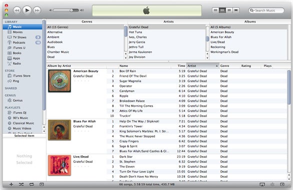
iTunes current UI works perfectly for that. I infinitely prefer the “Grid” view to the old column browser. Maybe I’m just visually oriented when it comes to selecting albums. I’m often as anal about album artwork (perfectly square, at least 500×500 pixels, larger if possible), as I am about my tags. I enjoy scrolling through the little squares of album art, finding the artist I feel like playing, and choosing the album. It’s visceral in a way that the boring old Column Browser isn’t. When it comes to organizing music, iTunes 12, with the “Recently Added” section at the top of the “My Music” view makes sorting and tagging new additions to the library easier, too.
iTunes still has problems. It’s still a Carbon app, with all the modal dialogue boxes and performance issues that implies. It is a bit heavy, though I’m not sure I agree with those who want to take a jigsaw and split it into component apps of Store, Music, and Movies like on iOS. Device management, especially trying to organize apps within iTunes is a pain in the butt, and Wi-Fi sync is still flaky. These are all issues, but they’re not ones that get in the way of using it as a media player.
If there’s an Apple media app that deserves UI criticism, it’s Music on iOS. Since iOS 7, the Music app has been frustrating and borderline unusable for me. I tend to listen to one album at a time, though if I go to select an album in Music from under an artist listing, it’ll play through that artist’s entire discography by album—in alphabetical order, no less. Sure, I could rotate my phone into Landscape mode and pick from the sort-of Grid View there, but that just lists every album on your device alphabetically, which doesn’t jibe with how I organize my music at all. Reverting the layout of the app to iOS 6 would go a long, long way to making my life easier. Instead, I’ll just use Ecoute.
In the meantime, if someone can explain in a little more detail where iTunes falls down for you as a way to play and organize music, I’d love to hear it. I just know it works for me.
- Alphabetical by artist, album sorted by year of first release within artist. I also use sort tags, so artists end up alphabetized under their last name. I grew up in a library, okay? ↩