Online, we all live in a social bubble. Our bubble is permeable, but only to a certain extent. We allow in those things that please us, in one form or another. Whatever it is you don’t want to see, there’s a tool to keep it out of your bubble, from keyword filters for your Twitter client, to ad blocking extensions for your browser. All it takes is a few minutes, and a few clicks, and your bubble is complete. I’ve written before about how easy it is to get trapped in an echo chamber of social media and news. When everything is on demand, there’s no incentive for us to demand the things that we don’t like. Our bubble is the echo chamber.
Amplifying this problem are the tools and algorithms that many services use to provide “custom” and “curated” content. Every social network scours the connections of you and your friends so that it suggests you follow people who are similar to what and who you follow already. Amazon.com knows the movies, music, and books you like, and will suggest other media that covers those same areas. These algorithms are constantly being honed and improved to provide you with stuff you’re more likely to want, which makes it all the more unlikely it will offer you something that exists outside of the bubble of your tastes and preferences. Statistically, you’re less likely to consume something that isn’t like something you’re already into, so there’s no incentive to provide anything else.
If you’re viewing this from a supply side perspective, wherein it’s your job to exchange goods for money, there’s no problem here. You’re merely filling demand, faster and more effectively than you would have otherwise. Reducing a person’s interests and tastes down to a few keywords that can be cross-referenced in a database search is just good business. If you’re viewing this from a demand perspective, it’s easy to see this as a boon as well. “Amazon, or Netflix knows me so well, that it knows I’ll be interested in Japanese Kaiju movies, stoner comedies, and albums by 90s alt-rock bands. It’s so much easier for me to find something now.” It’s a system by which our own laziness causes us to be denied opportunity to explore something outside of our comfort zone, because of our reliance on algorithms that decide for us. It’s not the algorithm’s fault. It can only work with the data we give it.
Fortunately, we’re not locked into what the algorithms supply us. As long as we’re interacting with other people, whether face-to-face or from behind keyboards, there’s the possibility of being exposed to something outside of that comfort zone. We’ll always have friends, family, co-workers, and casual acquaintances with their own tastes and preferences that differ from our own. Loathe as I am to use “organic” to describe it, as it’s become a buzzword, it’s an accurate way of describing how we get exposed to new ideas. We allow these into our bubble because they come from a trusted source, someone we’ve connected with despite our own bubbles–a new voice to break up the echo chamber. We’ll always be more than keywords in a database.
Within a few years, a self-identifying group of people called webloggers realized the power of that “What’s New†page, especially through the lens of a personal POV… Those weblogs were idiosyncratic, about a little bit of everything, and sent people away to keep them coming back — a stark contrast to the late-’90s portal strategy of “stickiness.â€
Jason Kottke on the Nature of Blogs and Writing Your Own World Book Encyclopedia
My first exposure to blogging as a concept came around in the days of what were termed “E/N sites,” which was an abbreviation for “Everything / Nothing”—an apt description of the content. It’s a concept that lives on, most prominently on Tumblr, but it’s moved into the social network space. The blog, as I came to know it in the late 90s and early 2000s was a public journal, a place to put your thoughts in front of what you hoped would be a sympathetic audience. Nothing exemplified this more than LiveJournal. A microcosmic Internet in its prime, LiveJournal made its bones as being a place where you could write your deepest, darkest thoughts and share them with either the world, or just a small circle of friends.
It may be a function of the innate writer in me, but I rarely shared links in the way a lot of the early bloggers did (and still do). I’d rather sit and bang out five hundred words or more about how I’m feeling and what I’m thinking than just link to something. And I rarely can think about one thing for very long. Neither, it seems, can Jason. “Funny to say that about new media, but if you look at other blogs… they cover narrow beats… By contrast, kottke.org is still written mostly in first person by me and ranges from essays on human extinction to videos of competitive wood planing in Japan.” When I registered this domain over a decade ago, the name was chosen with the mindset that I wouldn’t have a narrow focus.
Kottke notes that the blogs that cover narrow beats “are amenable to advertising,” which may explain the proliferation thereof. Still, when I think of blogging with more focus, my mind goes towards John Gruber and Merlin Mann’s famous SXSW talk on blogging. Four years later, Obsession + Topic + Voice is still a winning formula—in as much as succeeding at anything can be reduced to a formula—for creating a successful blog. Though this, of course, depends on your definition of success. There’s never a one-size-fits-all strategy for doing anything, anywhere. I hope I’m not putting words in Kottke’s mouth when I say that I doubt he blogs for money. He blogs to share his obsessions. I do too, just opting to share a smaller subset thereof.
We share cool stuff with our friends, and we share banal stuff with our friends. For most people, however, that sharing has moved from personal blogs to a space that is both more and less public. These are spaces like Tumblr, Facebook, and Twitter where, with the default settings, anyone can see what you’re sharing, but you know there’s a built-in, and defined audience of people you know and care about. It’s a space where feedback is immediate, if a bit less shallow than back in the old, golden days. What works for us may not work for them. Certainly, the barrier to entry is a lot lower now.
There’s always going to be a place for people who want to write and share their voice. There’s always going to be a place for people who want to create, as Jason says, “their own World Book Encyclopedia.” These places will overlap, though maybe not quite as much as they used to when this whole thing was getting started. Everyone has a voice, and everyone wants to be heard by someone. Now, they can, and we’re all the better for it.
There are no standard iOS apps in my phone’s dock. It’s dedicated, instead, to apps I need to access no matter what home screen I causally left myself on when I last locked my phone. This includes GV Mobile+, which replaces the built in iOS phone and messages apps, my task manager Things, Launch Center Pro which I wrote about yesterday, and Drafts. Drafts seems to confuse people—it certainly confused me when I first heard about it. It came out alongside another app, Pop. The idea behind the apps was to provide a scratchpad for iOS, an app you can quickly launch and type some stuff into to forget about/deal with later, typically via iOS copy and paste.
Later versions of Drafts added URL scheme support, allowing text to be sent from Drafts into any app that supported it. That’s when things got interesting. Nearly every piece of text I write on iOS begin life in Drafts. If I write on the subway where there’s no cell signal, it goes in Drafts. If I’m on my iPad at home, and want to work on a blog post, I start it in Drafts. When I’m on the go and need to send an email, I write it up in Drafts. Someone tells me something cool to check out online, I type it in Drafts. It’s the fastest, most painless, and—now that it includes Source Code Pro as a font choice—prettiest scratchpad app on iOS, bar none.
In January, Drafts 2.5 for iPhone and Drafts 1.5 for iPad dropped with a new feature that made it nigh indispensable for me: custom Dropbox actions. Previous versions of Drafts supported Dropbox, but only in a limited way. It could only write to files in an Apps/Drafts/ folder in Dropbox, which limited the interaction you could do with a Dropbox enabled text editor on Mac or iOS. To get around this limitation, I would type text in Drafts, and export it to Byword where I would save it to the Notational Data folder in my Dropbox—a cumbersome extra step. Now, anything I want to save from Drafts into Notational Data takes two taps, creating a file named with the date, time, and “snipx”—a file naming convention I got from Merlin Mann.
Drafts also includes actions that allow you to append and prepend to selected file in Dropbox. I recently started to keep a spark file for ideas and things to think about when I write. All I have to do when something hits me is launch Drafts, start typing, hit the “send to” button and tape “Append to Sparks File”. That’s all. The next time I look at my spark file, I’ll see what I added, complete with a date and time stamp. I’m planning to set up similar actions for other running lists I keep, like stuff to buy, books to read, music to listen to…
What makes Drafts so useful is that it’s fast. Drafts doesn’t have to synchronize a huge folder of notes before I can do anything. Launching it just puts me in front of a blank screen with a blinking cursor and a keyboard. From there, what I type can go anywhere I want, be it my boss’s email inbox, or this very website, in just a couple of taps. If you spend any time handling text on your iOS device, Drafts is for you. Just set up a couple of actions that suit your workflow, and get typing. It’s not for managing a folder of notes, there’s other apps for that. It’s just for getting text down fast, and putting it somewhere else faster.
Like Launch Center Pro, I know I’m only scratching the surface of what I can do with Drafts. Drafts 3.0 now supports expanding TextExpander snippets when launching actions, which opens up all sorts of possibilities. Also as with Launch Center Pro, Federico Viticci has come up with integrations that blow my mind. This includes a redonkulous bit of JavaScript that tales stuff from Safari, to Drafts, to Dropbox, to Due, and back to Safari. It’s mind-blowing, and an app that will change your game.
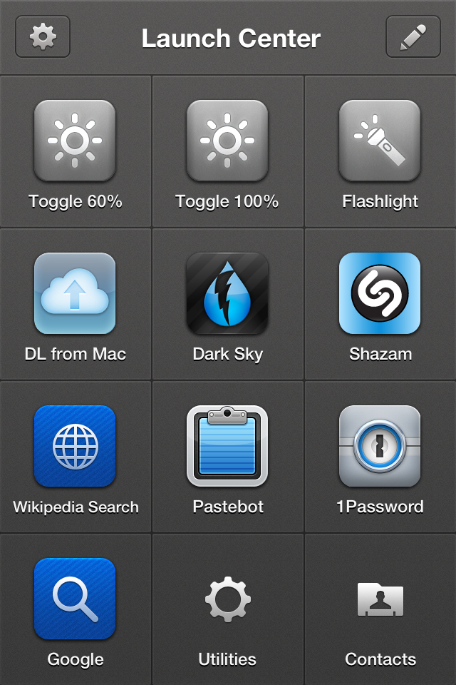
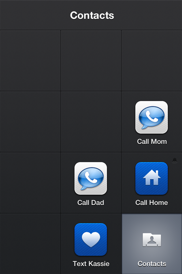
Imagine, if you will, a second home screen for your iPhone that you can access with a single tap. “But, Richard,” you say, “my iPhone has as many home screens as I want, and I just have to swipe to get to them.” Indeed, you can, but all you can do from those home screens is launch apps. This home screen is different. It’s special. With two taps, you can speed dial your parents, search 1Password, search Wikipedia, toggle your screen brightness, or, yes, turn your phone into a flashlight.

My main Launch Center Pro screen
The problem it seems a lot of people have with Launch Center Pro is that it’s easy see to see the app as just a secondary home screen with less icons. Launch Center Pro is closer in concept to Quicksilver or LaunchBar. It allows you to do deep dives into applications in two taps that would normally take twice as many. It’s easier to go into Launch Center Pro, and tap the 1Password icon to get into a search than it is to launch 1Password and search for a login. An app with a good set of URL schemes can allow you to work magic, putting you two taps away from all sorts of things that would take longer to get to the old fashioned way.
I do use Launch Center Pro as a basic app launcher. Three icons on the page are just quick access to apps that I don’t use often, but when I do use them, I want to get to them fast: Dark Sky (though this may fall to the wayside), Pastebot, and Shazam. This way, I can keep the actual apps stuffed away in a folder somewhere on my third page, and have easy access in just two taps. The spots they’d have taken up on page one or two now can belong to more important, more commonly used apps. Also, if there’s an app you want to run regularly, Launch Center Pro can schedule reminders, great for the “Call Home” action I have.
The power of Launch Center Pro, however, lies in its integration with other apps, and with the OS. With the top row of buttons, I can switch brightness modes, or turn on the LCD flash. The brightness buttons are toggles: between 10% and 60%, and between 60% and 100%. Previous versions of Launch Center Pro had tighter OS integration, including the ability to turn on and off Wi-Fi, Bluetooth, and Airplane Mode—but Apple put the kibosh on that. The latest version includes support for in-app text messaging, e-mail, and calling. This means that you’re two taps away from a speed dial, or an instant text to your girlfriend that you’ll be late.
Actions in Launch Center can access your clipboard, too. I use this with the app Transloader, so that if I come across something on my iPhone that I want to download on my Mac at home, I just need to copy the URL, open Launch Center Pro, and tap its icon. When I return to my Mac at home, the Transloader desktop app wakes up, and downloads it. Clipboard contents can be piped into anything that supports text in a URL, so you can copy text and have it land in any supported app, from OmniFocus, to Fantastical, to Drafts, to Safari And because it’s based entirely around URL schemes, this includes HTTP, so you’re two taps away from a Google or a Wikipedia prompt, both of which I use regularly.
I don’t use my phone as a phone much…
Launch Center Pro also allows you to group actions together in their own sub-home screen. Groups in Launch Center Pro work better than the default iOS folder implementation. Tap and hold on the group icon and slide your finger to what you want. I use it for my utilities and contacts screens, keeping me an extra tap from some useful apps like Deliveries, Text Expander, or the Google Authenticator, or from calling the folks. I’ve seen some folks with Launch Center Pro screens that are largely groups, which is great for clearing out the ol’ home screen.
I’m just scratching the surface of what I can do with Launch Center. The list of supported apps shows just some of the possibilities, while Federico Viticci shows the power of URL schemes and cross-app integration in a post that breaks my brain. I’m often thinking about how I can improve how I use my iPhone and improving my Launch Center Pro setup is a large part of it.
I recently had the chance to talk with Dalton Caldwell, founder of App.Net. He was in New York, and came to join a few App.Net users for a brunch meet-up at Pershing Square Café. While meeting him was great on its own, talking up the future of his service made my all the happier that I took the plunge and joined up. It’s clear that App.Net is trying to be a service that exists for the benefit of its users. This is why they’re charging people to join the service Having a stream of income from the people who use the service allows them to not be beholden to outside forces, be they venture capital firms who want to run up the value for an IPO, or advertisers who want to exploit the audience for their own gain.
There’s two types of businesses on the Internet: those who put users first, and those who put advertisers first. There’s no mutual exclusivity between free services and services that put users first, but one should be suspicious of any free service unless they have a clear way to keep the service running that won’t require them to capitulate to the demands of people who offer large sums to money for access to its users. To put it another way, you’re either the customer or you’re the product.
Freemium services survive because enough people are paying for the product that the free users get subsidized. Dropbox is the canonical example of this: as a free user you get 2GB of space, while the smallest paid tier gives you 100GB. Dropbox is, hopefully, making enough from paying customers to provide their service with enough overhead to pay for the free users, cover their rent, the cost of the Internet connection, salaries, power, cooling for the servers, and have enough left over for growth. App.Net is hopefully making enough money on the early adopters, paid-tier members, and developers who bought early API access that they can provide 10GB of storage, allow and encourage third-party apps, and build up the technology behind their service. Both of these companies are putting the users first.
Compare this to Twitter, Facebook, Google, or any of a huge number of companies that make the bulk of their profits from collecting and selling a user’s personal information to the highest bidder. Not all of them make it public, but it’s important to ask yourself that, if a company is giving something away, what will allow them to keep it going for the long haul. Mailbox for the iPhone was created, from the start, to be sold.. If not, they would have, or at least should have charged to use it. Thankfully, they sold to a company that puts users first. Meanwhile, Vine sells itself to Twitter, a company that knows it can take what people are doing on this new service and make money from it in a far less ethical way.
Few people put this amount of thought into the services they use, free or otherwise. The power of “free” is enough to short-circuit more rational parts of our brain that recognize that there is a cost to something. We just might not be paying it in cash, or a recurring charge on our credit card. More importantly, fewer people ever will put this amount of thought into the services they use, until something happens to one of them that will knock them out of the complacent malaise dominant, free services engender. Discussions like this have happened on the web with each free service that gets bought out or shut down, be it Instagram or Google Reader, but they’re becoming more frequent now. I feel the tipping point will be reached soon, and when it does, the way we, as a society, look at the Internet will change, dramatically.