Because everyone else is doing it, I’ve created the official Sanspoint t-shirt on Teespring. Now you can have the logo of your tenth favorite technology blog on your chest for the low cost of fifteen dollars, American. (Plus shipping.)
After you’ve bought your Marco.org shirt, and your Hypercritical shirt, and if you have anything left over, you can buy this one too. No promises it’ll be there by WWDC. No promises anyone will know what the hell your shirt means. I do, however, promise the sexy sp ligature from Mrs Eaves.
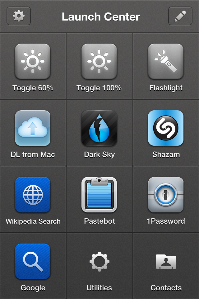
Imagine, if you will, a second home screen for your iPhone that you can access with a single tap. “But, Richard,” you say, “my iPhone has as many home screens as I want, and I just have to swipe to get to them.” Indeed, you can, but all you can do from those home screens is launch apps. This home screen is different. It’s special. With two taps, you can speed dial your parents, search 1Password, search Wikipedia, toggle your screen brightness, or, yes, turn your phone into a flashlight.
My main Launch Center Pro screen
My main Launch Center Pro screen[/caption]
The problem it seems a lot of people have with Launch Center Pro is that it’s easy see to see the app as just a secondary home screen with less icons. Launch Center Pro is closer in concept to Quicksilver or LaunchBar. It allows you to do deep dives into applications in two taps that would normally take twice as many. It’s easier to go into Launch Center Pro, and tap the 1Password icon to get into a search than it is to launch 1Password and search for a login. An app with a good set of URL schemes can allow you to work magic, putting you two taps away from all sorts of things that would take longer to get to the old fashioned way.
I do use Launch Center Pro as a basic app launcher. Three icons on the page are just quick access to apps that I don’t use often, but when I do use them, I want to get to them fast: Dark Sky (though this may fall to the wayside), Pastebot, and Shazam. [1] This way, I can keep the actual apps stuffed away in a folder somewhere on my third page, and have easy access in just two taps. The spots they’d have taken up on page one or two now can belong to more important, more commonly used apps. Also, if there’s an app you want to run regularly, Launch Center Pro can schedule reminders, great for the “Call Home” action I have.
The power of Launch Center Pro, however, lies in its integration with other apps, and with the OS. With the top row of buttons, I can switch brightness modes, or turn on the LCD flash. The brightness buttons are toggles: between 10% and 60%, and between 60% and 100%. [2] Previous versions of Launch Center Pro had tighter OS integration, including the ability to turn on and off Wi-Fi, Bluetooth, and Airplane Mode—but Apple put the kibosh on that. The latest version includes support for in-app text messaging, e-mail, and calling. This means that you’re two taps away from a speed dial, or an instant text to your girlfriend that you’ll be late.
Actions in Launch Center can access your clipboard, too. I use this with the app Transloader, so that if I come across something on my iPhone that I want to download on my Mac at home, I just need to copy the URL, open Launch Center Pro, and tap its icon. When I return to my Mac at home, the Transloader desktop app wakes up, and downloads it. Clipboard contents can be piped into anything that supports text in a URL, so you can copy text and have it land in any supported app, from OmniFocus, to Fantastical, to Drafts, to Safari And because it’s based entirely around URL schemes, this includes HTTP, so you’re two taps away from a Google or a Wikipedia prompt, both of which I use regularly.
I don’t use my phone as a phone much…
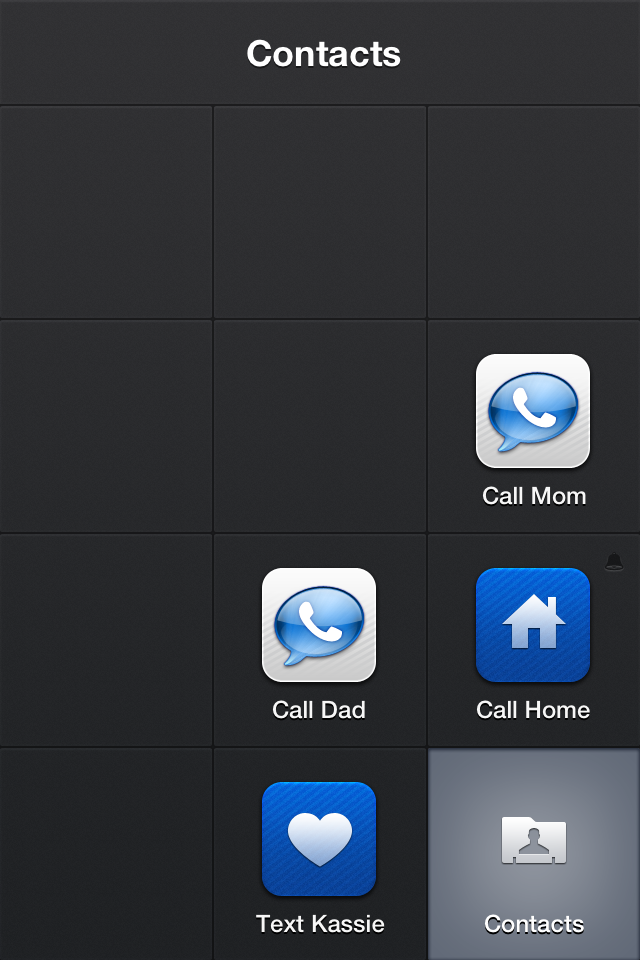
Launch Center Pro also allows you to group actions together in their own sub-home screen. Groups in Launch Center Pro work better than the default iOS folder implementation. Tap and hold on the group icon and slide your finger to what you want. I use it for my utilities and contacts screens, keeping me an extra tap from some useful apps like Deliveries, Text Expander, or the Google Authenticator, or from calling the folks. I’ve seen some folks with Launch Center Pro screens that are largely groups, which is great for clearing out the ol’ home screen.
There’s a lot to be said for a piece of software that you can just jump right into. Apple’s built half their reputation on software that is intuitive enough that even a toddler understands it. As long as something is easy, works, and has enough features to satisfy 90% of users 100% of the time, it’s typically a good piece of kit. The great bits of kit are like that, but leave room for power users to tweak and configure things so that the application works better. And then, there’s the amazing apps, the ones that you can’t just jump into blindly, that reward the user to take a little time to think and set things up. Those are gamechangers.
Quicksilver, LaunchBar, and Alfred are the first examples that come to mind. Open them up, and they’ll do a fair bit for you, but to get the real value of them, you need to dig into settings menus and preference windows, install plugins and extensions, and tweak them to work exactly the way you think. It’s possible to use a Mac without one of these tools, but once you’ve tried them, you really won’t want to. When setting up both my work iMac, and my new MacBook Pro, the first four apps I installed were, in order: Dropbox, 1Password, LaunchBar, and TextExpander. They’ve become so ingrained into my workflow that to not have them would cripple me. [1]
I started in on this line of thought after an App.Net conversation with Andrew Marvin[2] about the iOS app Drafts. Drafts is where nearly every piece of text I create on an iOS device begins its life, including this very essay you’re reading right now. It’s an exceedingly simple application that is just a text box, and a host of hooks to other apps and services that you can send the text to. Mr. Marvin’s quote after I told him that was: “Why don’t you just put the text where it goes?” In short, Drafts is faster. To add to my spark file in Nebulous Notes, I have to synchronize my entire notes folder, find my sparks file—time consuming, even with Merlin Mann’s “q” trick—and scroll to the bottom to add text. In Drafts, I launch the app, type, and push a button. Done. It’s not something you can do out of the box—it takes a bit of time, patience, and configuration, but the rewards are worth it.
Another iOS app, Launch Center Pro, has a similar reward of investment to time spent configuring it. At first it just looks like a second, smaller, home screen, which may make you ask like Andrew did: “[W]hy would I open an app to launch an app when I can just launch the app?” For me, Launch Center Pro serves as an omnipresent gateway to apps that I want to access quickly, and in certain ways. If I need a password for something, I tap LaunchBar, tap 1Password, and type a search query. Hit go, type my 1Password password, swipe to the right, tap the clipboard icon, and I have my password. It sounds more complex than it is, but it’s also way faster than finding my Utilities app folder, launching 1Password, and finding the search field. On both of these apps, I know I’m just scratching the surface of what they can do. Making these little tweaks is often worth the time. A bit of upfront effort can make life easier down the road. Starting Monday, I’ll have a couple posts on how I use each of these apps.
Imagine typing out my email address every time like an animal. ↩
Great writer, one-third of Crush On Radio, and a damned handsome man. ↩
It must be a cultural difference. The Guardian, a British newspaper best known for lax editing, recently published an edited down essay by Rolf Dobelli with the completely not attention grabbing title of “News is bad for you”. In the United States of America, no news agency would dare publish such a thing for risk of losing their impressionistic target demographic, though maybe the straits of newspapers in the UK are dire enough to warrant the risk. Whatever the reason, it's surprising that a newspaper would publish something so antithetical to its mission. I'm almost proud.
Sadly, the essay is little more than a polemic with unsubstantiated claims about the effects of news reading on biology and cognition that lack even a token citation to a scientific or medical journal. The effect is that of a curmudgeonly old man, complaining about kids these days, especially this comment near the end: “I don't know a single truly creative mind who is a news junkie… On the other hand, I know a bunch of viciously uncreative minds who consume news like drugs.” I so love when someone takes their own narrow worldview and expands it to the rest of the world. It makes deciding whether to dismiss their points a lot easier. This is a problem, because Dobelli is actually on to something, just going about it in a pigheadedly wrong way.
News is fundamentally broken, or at least commercial news is. The example Dobelli uses when he starts making points illustrates this, but only to a point. “A car drives over a bridge, and the bridge collapses. What does the news media focus on? The car. The person in the car… But that is all irrelevant. What's relevant? The structural stability of the bridge.” Certainly, the structural stability of the bridge, or lack thereof, is the relevant part. The human element, however, is what brings the reader in. Without it, a news story reads like a bunch of dry facts that would only interest a Dr. Drang or John Siracusa type, and even they write with an ear towards how normal humans think. If the news story is exclusively about the car and the driver, and not the bridge, we have a real problem. Some newspapers and websites will cover the human interest angle exclusively over exposing the stability issues of our bridges. Those are the ones people should stop reading.
There's also a point to be made about the shallowness of a lot of news. Breaking news updates, sensational headlines, Twitter alerts, and the 24-hour news cycle add up to a lot of repetition of very little information. During the Boston Manhunt, not only was criticism leveled at news channels for fighting over being the first to report information—sometimes even inaccurate information—but also for the endless parade of talking heads that fill time by telling you how little they know in different ways. It's a Catch-22. They can't not have something on the air, but they don't have anything to talk about. The more new articles a news site puts up during a news event, the more slots they have to put ads, and more chances to bring up their page views. This is a situation that is antithetical to good news reporting.
This may come up in the book that Dobelli is promoting 1, but another way that news is broken is the echo chamber effect. This occurs in two ways, the simplest being that in a situation with limited information, the various news media will just echo what everyone else is reporting until new information comes along. The other is more insidious, and has only amplified in the last decade as a consumer can now pick and choose exactly what they want to hear, down to political slant. You can choose to get the liberal slant of NBC News, the conservative slant of FOX, or the whackadoodle slant of Alex Jones. 2 Worse, you can choose to have this be all you get. The problem here should be obvious.
The majority of my personal news consumption is limited to the five minute NPR Morning News podcast. I typically avoid most anything else, unless it affects me, or it's big enough to be unavoidable. I love to read long-form articles on issues in technology, and I'm a sucker for a good Apple rumor (but only the good ones). I put, I think, more thought than most into the choices of what news media I consume, erring towards impartiality, freshness, and relevance. A bridge collapse in Minnesota might not seem relevant, but if I'm driving to work over a bridge every day, it might get me to worry about whether I'll be the next human interest angle.
We shouldn't stop paying attention to the news. We should demand to get better news. The tradeoff may be that we get less news, less often—less all-you-can-eat buffet, and more upscale causal restaurant. However, the models by which news is made, distributed, and paid for make such a proposition almost impossible. Still, as profits dwindle among the big newspapers, and as TV news crumbles under the weight of needing to be fast, accurate, and profitable, maybe someone will stumble upon the formula for good news that's informative, relevant, and worth our time. But first, there's a special report on how what's in your child's lunchbox may cause cancer.
Of course, his essay is promoting a book. Any time you come across a deliberately antagonistic essay like this, it's typically to promote some product by the writer. (n.b.: I don't have a book. Yet.) ↩
I've already set up a filter in gMail to send anything containing Alex Jones to the trash without me seeing it. Don't bother. ↩
There’s two types of businesses on the Internet: those who put users first, and those who put advertisers first. There’s no mutual exclusivity between free services and services that put users first, but one should be suspicious of any free service unless they have a clear way to keep the service running that won’t require them to capitulate to the demands of people who offer large sums to money for access to its users. To put it another way, you’re either the customer or you’re the product.
Freemium services survive because enough people are paying for the product that the free users get subsidized. Dropbox is the canonical example of this: as a free user you get 2GB of space, while the smallest paid tier gives you 100GB. Dropbox is, hopefully, making enough from paying customers to provide their service with enough overhead to pay for the free users, cover their rent, the cost of the Internet connection, salaries, power, cooling for the servers, and have enough left over for growth. [3] App.Net is hopefully making enough money on the early adopters, paid-tier members, and developers who bought early API access that they can provide 10GB of storage, allow and encourage third-party apps, and build up the technology behind their service. Both of these companies are putting the users first.
Compare this to Twitter, Facebook, Google, or any of a huge number of companies that make the bulk of their profits from collecting and selling a user’s personal information to the highest bidder. Not all of them make it public, but it’s important to ask yourself that, if a company is giving something away, what will allow them to keep it going for the long haul. Mailbox for the iPhone was created, from the start, to be sold.. If not, they would have, or at least should have charged to use it. Thankfully, they sold to a company that puts users first. Meanwhile, Vine sells itself to Twitter, a company that knows it can take what people are doing on this new service and make money from it in a far less ethical way.
Few people put this amount of thought into the services they use, free or otherwise. The power of “free” is enough to short-circuit more rational parts of our brain that recognize that there is a cost to something. We just might not be paying it in cash, or a recurring charge on our credit card. More importantly, fewer people ever will put this amount of thought into the services they use, until something happens to one of them that will knock them out of the complacent malaise dominant, free services engender. Discussions like this have happened on the web with each free service that gets bought out or shut down, be it Instagram or Google Reader, but they’re becoming more frequent now. I feel the tipping point will be reached soon, and when it does, the way we, as a society, look at the Internet will change, dramatically.
They certainly had enough to buy [Mailbox], which made me comfortable enough to start using the app. If I can trust Dropbox with the files that make up my digital life, I feel I can trust them with my e-mail as well. ↩
 Because everyone else is doing it, I’ve created the official Sanspoint t-shirt on Teespring. Now you can have the logo of your tenth favorite technology blog on your chest for the low cost of fifteen dollars, American. (Plus shipping.)