Stop Hiding the Log In Button
There’s a trend across the Internet for big, graphical home pages designed to funnel new user growth. Tumblr’s home page below is a perfect example of the form: a giant background image with a clear and obvious sign up form. There’s just one problem, and it only affects existing users: the “Log In†button is almost impossible to find.
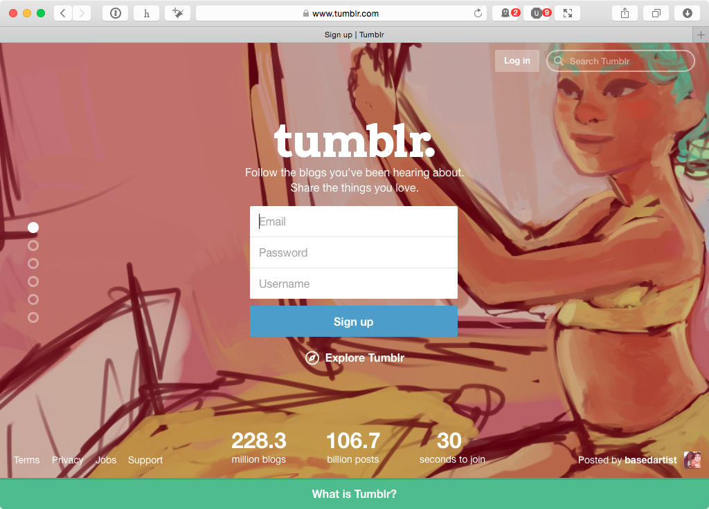
It’s translucent, gets lost against noisy backgrounds, and shoved off into the top left corner. That’s been shown time and time again to be the last place a user looks, at least for cultures that read left-to-right. It’s not just the web. Even phone apps are getting into this nonsense. If you look at myFitnessPal, the “Log In†button is given second billing, under the “Sign Up†option. To a new user, someone who might have started with myFitnessPal on the web, and wants to start on their phone, they could easily miss it. There’s nothing to make it stand out as a button, except that it’s in bold text. [1] 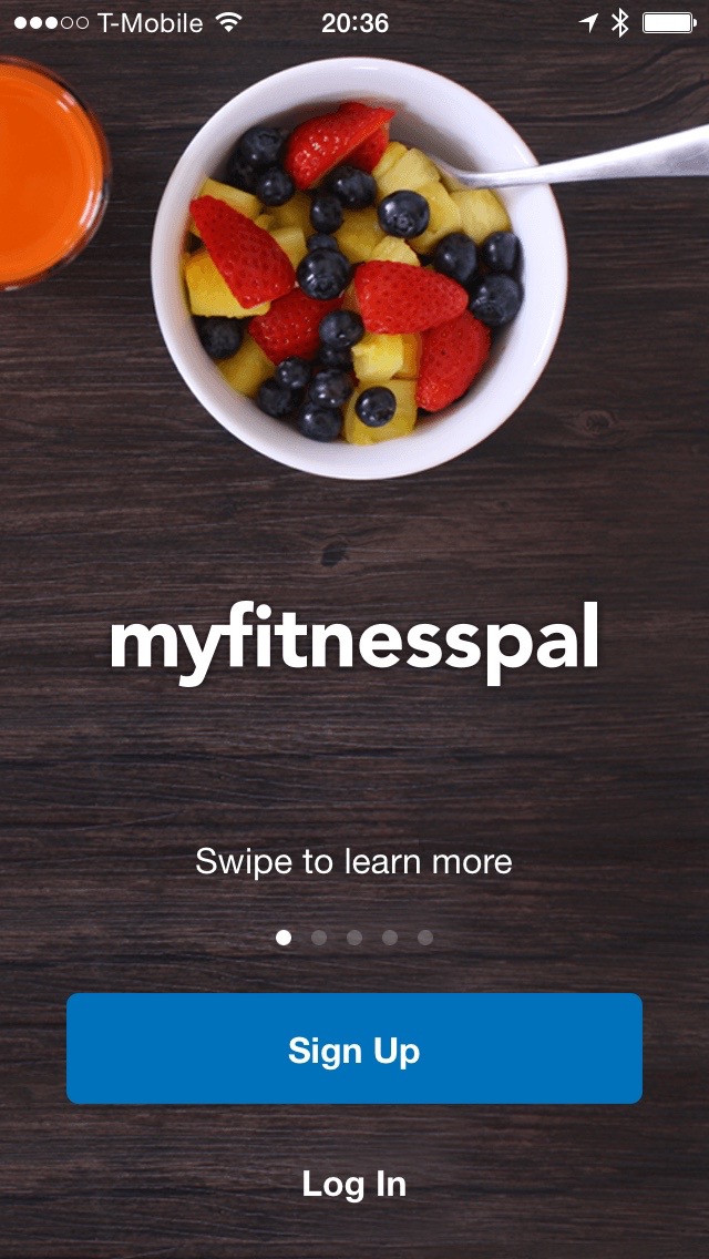
This is the result of “growth hacking†and optimizing for new user growth over existing users. On the surface, it makes some sense. The most important metric, especially if you’re looking to get VC funding, is often new user growth. By making it easier for a new user to sign up to your product, you have a better shot of making that hockey-stick growth curve happen. A necessary evil, to be sure. I’m unable to find stats on how many users click the “remember me†boxes on many sites, or how many sites leave it checked by default. I’ll assume that once someone is logged in, they’re logged in, almost for good.
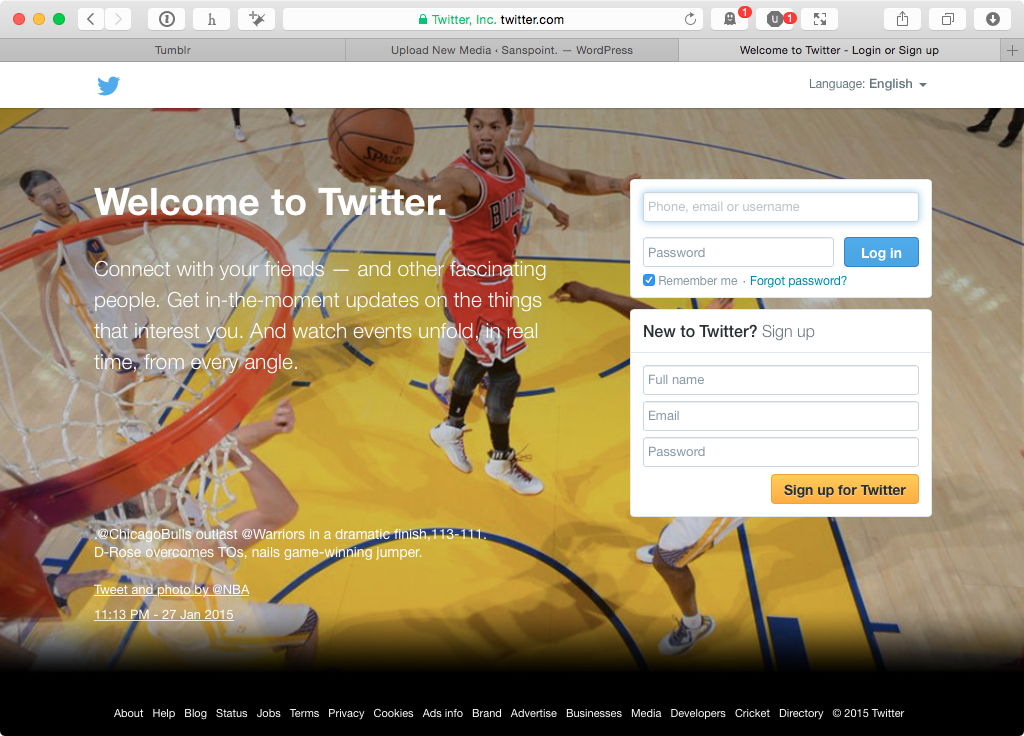
Almost is the key word. A user might switch browsers, or they might switch operating systems—on desktop and on mobile. They might opt not to restore their new phone from the cloud backup, if they have it. Hell, someone malicious might just log them out for the fun of it. Any UI/UX designer worth their salt should be prepared for such an inevitability and make it easy and obvious to log back in. Balancing that with the need to drive user growth isn’t difficult, either. You can do what Twitter does, by having a login form and a sign up form on the same page, but I have a better idea.
If you’re set on just having one form to rule them all, why not make it clear that you can use it as both a signup form, or a login form? To Tumblr’s credit, I tested their sign up form to see if it worked that way while writing my complaints, and it does. There’s no indication that this is the case, however, until you click the button and are taken to the dashboard. Good UI and UX requires that the behaviors be clear and defined for the user. There’s no excuse otherwise. “Growth hack†if you must, but do it in a way that respects your existing users. Stop hiding “Log In†buttons, for a start.
-
Someone’s going to bring up the iOS 7 and 8 UI, and its accessibility issues. Stock iOS uses defined text colors to show what you can tap on, and the “Log In†button is the same color as every other line of text on that screen. Also, myFitnessPal is not using stock iOS widgets for this screen, because there’s a defined button shape.  ↩