It’s the degree of offense I get from the articles, podcasts, and other Apple chat that bugs me. I don’t know if they don’t think that consumers will be able to know the difference, or if they’re just offended by the idea. While it’s not a new phenomenon, Apple helped stoke the flames with it’s billion-dollar trade dress lawsuit against Samsung. Going back further, there was Apple v. Microsoft over the Windows 3.0 interface.Plus ça change… Frankly, it just comes off like endless partisan nonsense to me, something which tech journalism is already too rife with.
A credit to Tim Cook is that, since his tenure as CEO began, Apple’s become less litigious about trade dress crap, and opted to just focus on making products that don’t suck. A point could be made about competitors in Apple’s spaces using Apple-inspired design as a way to make their products appear better without putting Apple’s degree of care and skill into it, but even the best design can’t hide crap. If the Asus Zenwatch 2 succeeds, it won’t be because it has a digital crown and comes in rose gold. If Tim Cook’s Apple sees this as a threat, I’m sure they’d bear down on Asus with the full force they’re capable of. I don’t think they do.
You don’t like the Zenwatch 2? Don’t buy it. Tell your friends and family, if they ask for advice, not to buy it. Otherwise, relax. Your own Apple Watch isn’t going to become useless and worthless because some other company has a product that looks and is marketed similarly. It doesn’t work that way.
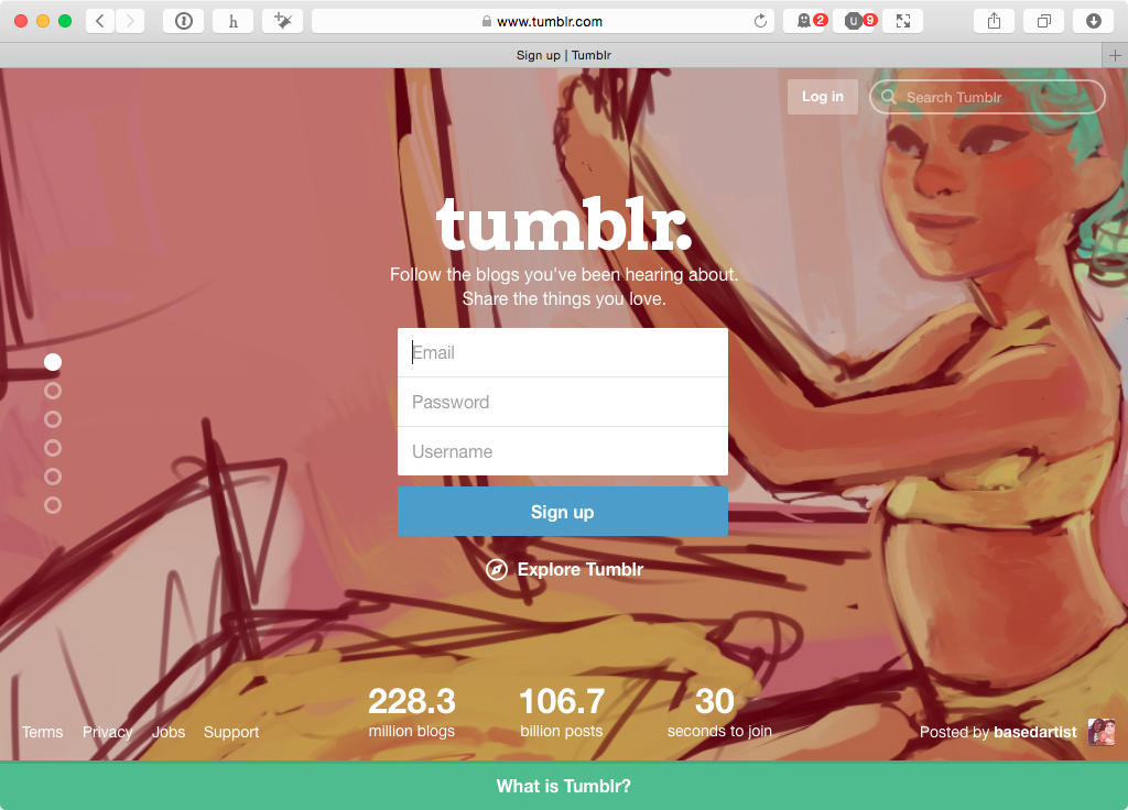
There’s a trend across the Internet for big, graphical home pages designed to funnel new user growth. Tumblr’s home page below is a perfect example of the form: a giant background image with a clear and obvious sign up form. There’s just one problem, and it only affects existing users: the “Log In†button is almost impossible to find.
It’s translucent, gets lost against noisy backgrounds, and shoved off into the top left corner. That’s been shown time and time again to be the last place a user looks, at least for cultures that read left-to-right. It’s not just the web. Even phone apps are getting into this nonsense. If you look at myFitnessPal, the “Log In†button is given second billing, under the “Sign Up†option. To a new user, someone who might have started with myFitnessPal on the web, and wants to start on their phone, they could easily miss it. There’s nothing to make it stand out as a button, except that it’s in bold text. [1]Â
This is the result of “growth hacking†and optimizing for new user growth over existing users. On the surface, it makes some sense. The most important metric, especially if you’re looking to get VC funding, is often new user growth. By making it easier for a new user to sign up to your product, you have a better shot of making that hockey-stick growth curve happen. A necessary evil, to be sure. I’m unable to find stats on how many users click the “remember me†boxes on many sites, or how many sites leave it checked by default. I’ll assume that once someone is logged in, they’re logged in, almost for good.
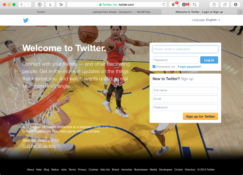
Almost is the key word. A user might switch browsers, or they might switch operating systems—on desktop and on mobile. They might opt not to restore their new phone from the cloud backup, if they have it. Hell, someone malicious might just log them out for the fun of it. Any UI/UX designer worth their salt should be prepared for such an inevitability and make it easy and obvious to log back in. Balancing that with the need to drive user growth isn’t difficult, either. You can do what Twitter does, by having a login form and a sign up form on the same page, but I have a better idea.
If you’re set on just having one form to rule them all, why not make it clear that you can use it as both a signup form, or a login form? To Tumblr’s credit, I tested their sign up form to see if it worked that way while writing my complaints, and it does. There’s no indication that this is the case, however, until you click the button and are taken to the dashboard. Good UI and UX requires that the behaviors be clear and defined for the user. There’s no excuse otherwise. “Growth hack†if you must, but do it in a way that respects your existing users. Stop hiding “Log In†buttons, for a start.
In case you missed it, Lenovo has been in the news for pre-installing adware known as Superfish that has a huge, exposed security flaw that “exposes Lenovo users to man-in-the-middle attacks.” Truth it, it was only a matter of time before something like this happened to a major PC manufacturer. PC hardware has been commoditized, and margins in the PC business are razor thin. In order to make up lost profits, many PC manufacturers load up their machines with junk in exchange for a few extra bucks profit on each unit sold. Apple was making ads about this exact thing back in 2009, and now Microsoft offers “Signature Edition” PCs through their stores with the promise of a clean Windows install. The only other way to get a clean Windows installation is to do it yourself, which is why I’m surprised it only took until now for a major PC manufacturer to get bitten in the ass by their own profit scrounging.
Lenovo’s mistake (to put it politely) is one of the biggest violations of customer trust in an industry not known for being trustworthy. Yet, Lenovo is also a victim—the commoditization of PC hardware has made it easier, and cheaper, for people to get a decent computer that lasts longer, while making it harder for hardware companies to make a decent profit. With PC shipments dropping, quarter over quarter, it’s that much harder to keep things afloat. Computers are already something that the average person has little trust in, with endless software updates, pre-installed trialware, outsourced tech support, and pushy sales people… so what’s a little adware in an already untrustworthy relationship, right?
That’s the Catch–22 underlying this whole situation. A PC hardware company that values trust must either charge a premium or earn slimmer margins. Either way, they’re competing with cheaper, commodity hardware sold by companies with less scruples, or at least less scrupulous shareholders. Yet, inexpensive commodity PC hardware makes it easier for socio-economically disadvantaged people to get on the Internet, and become part of the digital economy. A world where one needs a middle-class income to afford a basic personal computer is a dangerous one that can lead to further social and economic inequity. This isn’t to say owning a computer is enough—It’s not, but it’s a big part.
My hope for the outcome of the Superfish fiasco is that hardware companies will think harder about the junk they load up their products with. We’ll never be free of PCs being sold with unwanted and unnecessary software. The subsidization of commoditized hardware is a frustratingly necessary evil to get computers in the hands of more people who need them. Because of that alone, I don’t think anything is going to change after Superfish. The value of customer trust in the PC hardware business just isn’t worth more than what crapware companies are willing to pay to have their products pre-installed. The end result? A two-tiered computing experience: a secure, crapware free one for the people who can pay for a “signature experience” (or a Mac), and a spammy, insecure one for the poor. At least it’s an improvement over the company that offered free, ad-supported computers in 1999.[1]
While checking my RSS feeds during a little down time at work, I had a realization—I don’t give a flying fuck about the “business” of technology. I don’t care about who sold more phones, made more profit, raised how much funding, or has more leverage in some market. None of it interests me. Maybe if I had more of a financial stake in a company beyond owning and using their products, it might matter to me more, but the financial outlook for any tech company only matters insomuch as it allows them to stay in business while I own and use their products. That’s it.
Few of us, have more than a token financial stake in the companies that make our tools. It’s all emotional. A company’s finances, sales numbers, market share—they’re all just ways to keep score and define a winner in a pointless game. It’s another factoid we can use to root for our side in the miserable factionalism of technology fandom. The impact of the numbers on how and what we can use our tools for is negligible, at best.
I’m opting to tune as much of the financial crap out of my feeds as I can. If the bottom falls out of Apple, or some service I like gets bought out and sunsetted, I’m sure I’ll find out on my own. Money and numbers are always going to be the background chatter of any business. It’s unavoidable. At least I have the power to turn the volume down and focus on what matters to my life and work: good tools, and ways to use them to make better work.
So much advertising is predicated on interruption. Think about television, where the interruption of advertising is so codified, that many shows deliberately insert cliffhanger moments just before the next batch of commercials. Back in the early days of television, sponsors attempted to integrate their advertisements into the narrative of the program, as if the interruption to the story wouldn’t be noticed. Compared to that mess, I appreciate the bald-faced nature of television ads.
Interruption is what makes advertising on social media such a problem. You’re reading through your stream, catching up with the moments of your friends, maybe sharing your own, and suddenly there’s an advertisement for something. It’s an interruption of your conversation. Much like back in the early days of television, companies often try to make their ads blend in to their streams, as if you won’t notice. Unlike the early days of television, the social stream companies have the ability to find ways to at least make the ads relevant, as if that can offset the interruption.
Why are we so up in arms when Twitter decides to algorithmically determine what shows up in our feeds? It’s because they’re interrupting the conversations in our stream. Why is it so obnoxious when Facebook’s “Top Stories” hides important updates from our friends? It’s an interruption to the narrative flow of people’s lives. Even worse is that it’s an interruption that pretends to be part of the conversation. That’s why they relentlessly track our browsing, our conversations, and anything else they can get. Like the sponsorships on 50s TV, they think that if the ads are integrated into the experience, we’ll forgive the interruption.
I take the position that advertising is an unfortunately necessary evil. Nobody likes to hear it, but as long as there are products that need to be sold, advertising will exist. This will never change. The advertising arms race comes from the human ability to eventually tune out repeated, non-value stimulus (e.g. Banner Blindness). What can done if none of us want to be interrupted by irrelevant (or relevant, but unwanted) advertising?
We could pay, but discussions about people’s unwillingness to pay for ad-free, tracking-free services often ignore those who can’t pay for those services. We already have a stratified Internet between the haves and have-nots (moreso than you might think). A privacy-conscious paid-tier Internet, above and beyond the existing cost of service from your local ISP, would only make matters worse. There must be a third way, a balance that can be struck between the needs of Internet users, between companies that need to make money to keep the lights on, and between the necessary evil of advertising.